

Aggregate Project Plan

The fundamental premise of Aggregate Project Plan model is that no single project defines the future of the company. A company's future is defined by the aggregate sum of all the projects. And that means that at any point of time, there should be a view of all the projects as a central view. The question then would be, how you plot the mass and how do you identify the gaps in strategy?
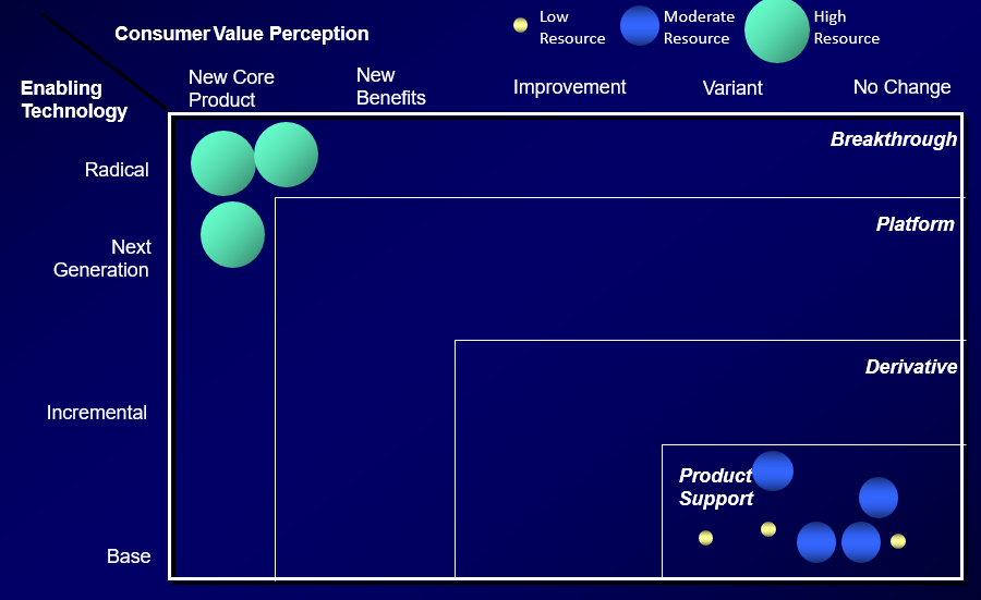
Aggregate Project Plan is one such strategy which classifies projects on a 2D grid centering around Degree of Technology and Degree of Business Process Change.
There are three kinds of projects -
Derivative
Platform
Breakthrough
While Derivate Projects are small features which get executed quickly, Breakthrough Features are enterprise transformation features which require deployment of large resources. In essence, one can look at Platform Projects as a bunch of Derivate Features grouped together. However, one cannot treat Breakthrough features such because these may require completely new technologies but surely massive business process changes.
If you plot them on a piece of paper, you have a cleaner view - Objective, Size of Feature and kind of feature. The goal is to have a well balanced portfolio with optimum focus on both the existing infrastructure and the proposed new world - ready for change and working towards it but still having the correct focus on the existing environment.

Too many Derivative Features aiming at the same Objective is a problem - why aren't they clubbed together into Platform Projects?
Why is there no focus on Breakthrough Projects? Are the Platform Projects really ensuring us the desired value?
Do we have the resources for all these? Can we optimize the resource deployment and alignment to objectives? One needs to fundamentally realize the fact that resource deployment for features is not static and will change with time.

What can we pruned? Do we need to have such scattered and a large portfolio?
What are the outliers? Why is there an imbalance and why are they not fitting into the standard model?
Why are there two big green blobs in two different quadrants? How are they linked to each other?
Is the focus more on high risk breakthrough features or for maintaining the existing environment? Or is there an optimum balance between the both(as like in the plot above)?
For example, look at the Large Grey in the left. Let's say, it's porting the website from React to Angular. What exactly is the business value added? Such are the questions to look at.

Further more, one can consider Support as a subset of Derivate Project itself.

As one would see, the template is flexible enough to suit our needs!!
Another variant involves R&D. In essence, you choose what fits your needs.

However, one should also note the effort required to deploy such features and if we have the right skill set to achieve that.
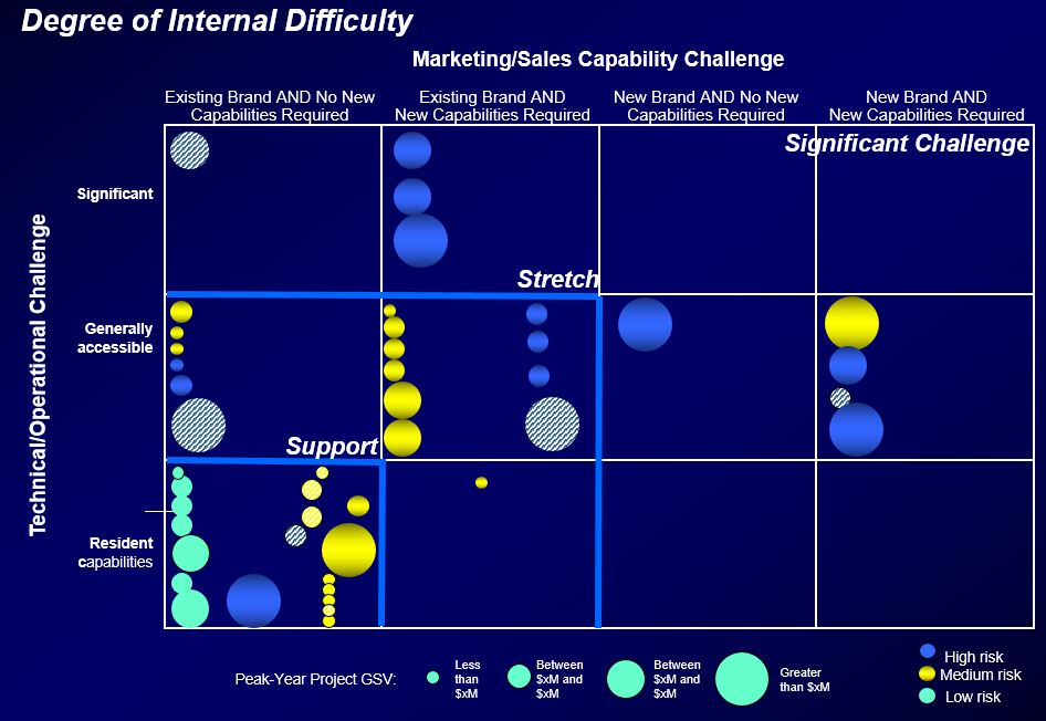
And along with it, the potential market impact. In essence, it's a different kind of visualization for Wardley Maps and nothing more. But, Wardley Maps focus on a process while this one seems to focus on the complete set of features available.

References
https://www.classes.cs.uchicago.edu/archive/2011/spring/51075-1/presentations/russ.pdf
Henderson, Rebecca, “Actually Doing (Technology & Product Strategy)” https://view.officeapps.live.com/op/view.aspx?src=http%3A%2F%2Fweb.mit.edu%2Frhenders%2Fwww%2FTeaching%2Fday2b_Jan05.ppt&wdOrigin=BROWSELINK